


custom logo designs & marketing materials
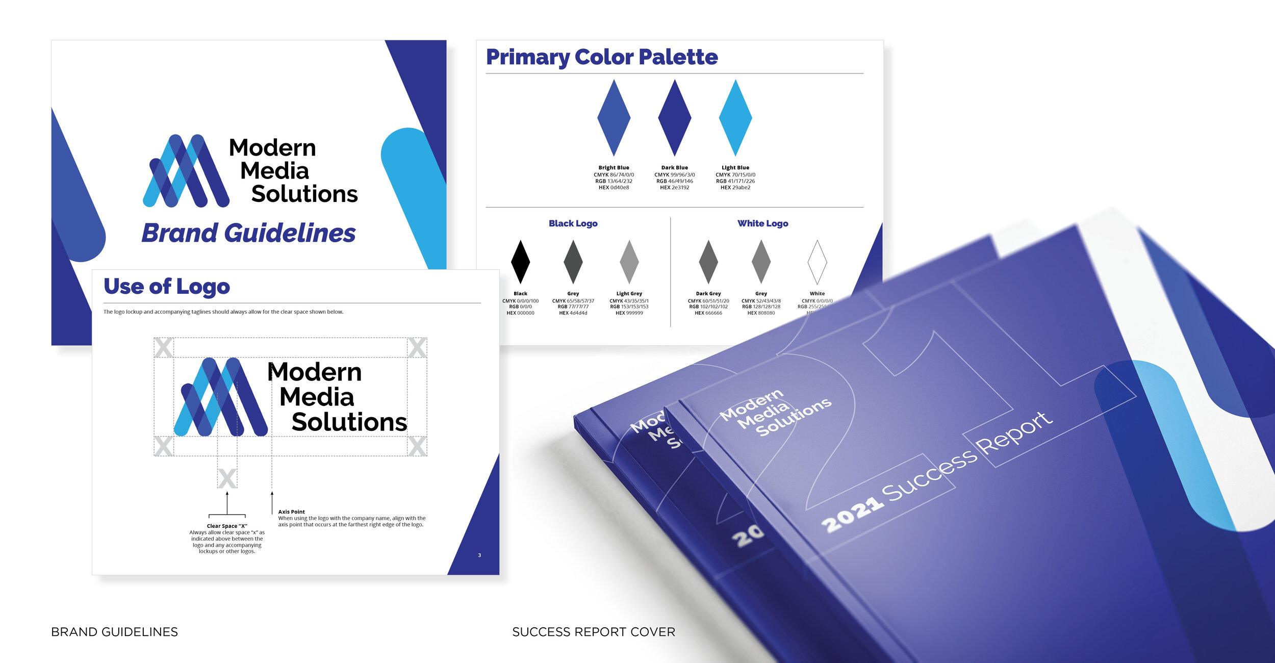
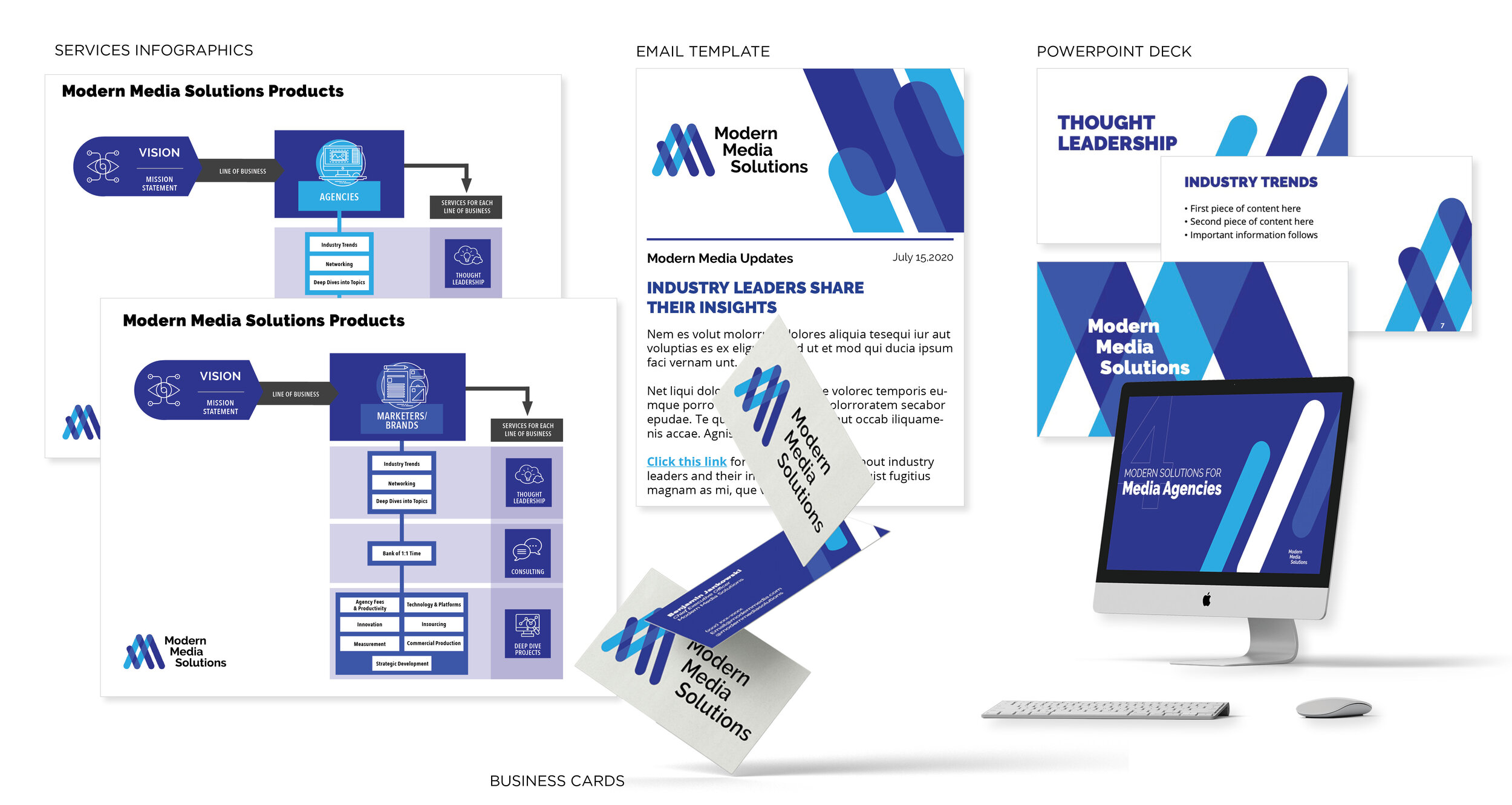
Naming, Brand Discovery, Logo design and brand buildout for Modern Media Solutions, a modern media consultancy that empowers companies to succeed in today’s complex media landscape.
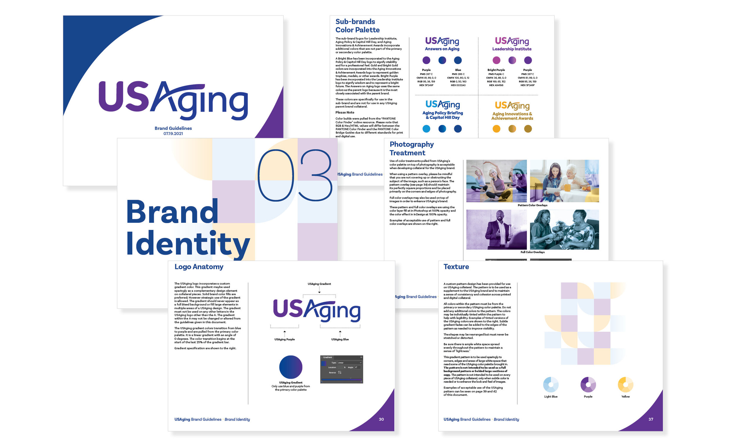
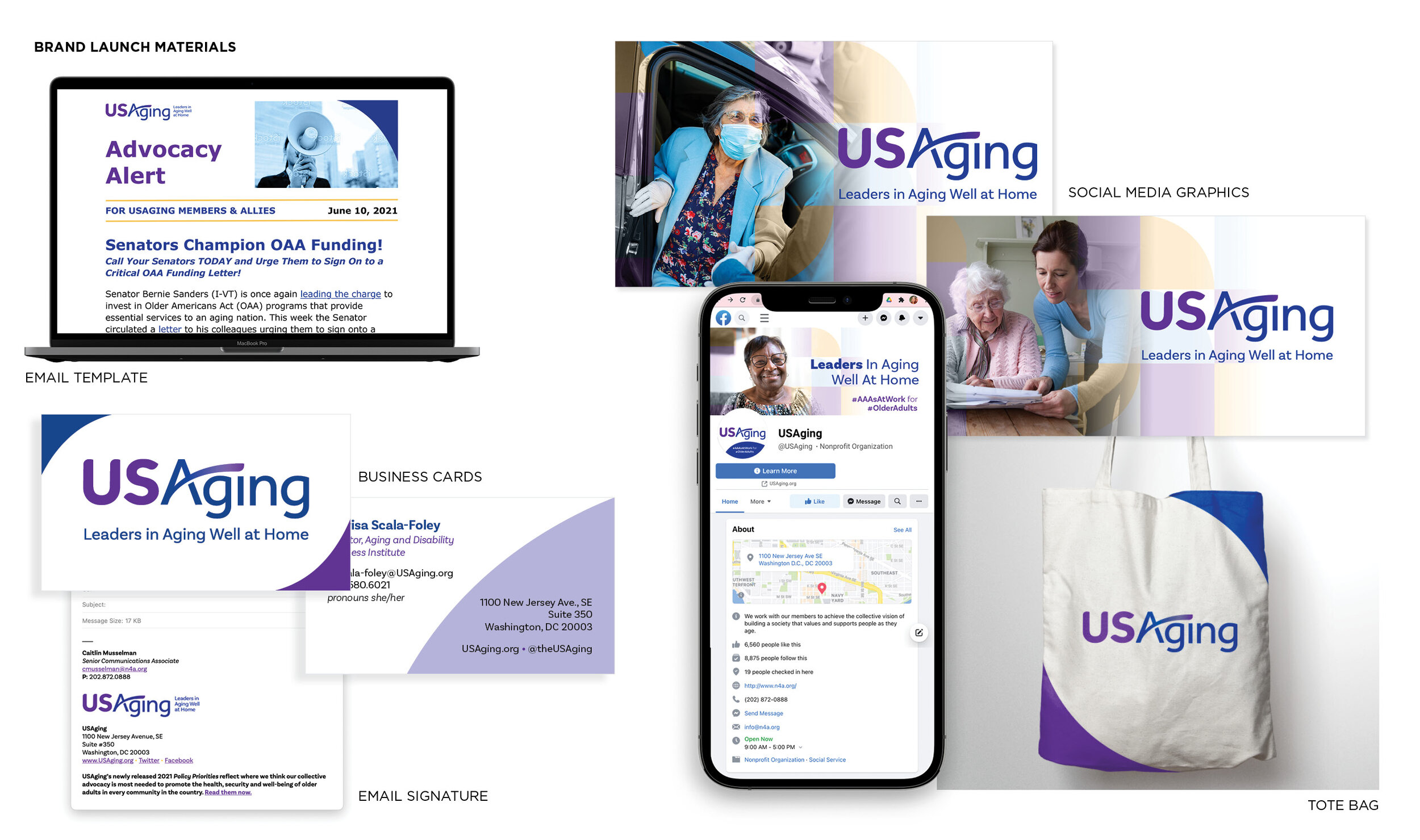
Samples from the style guide for USAging (formerly N4A The National Association of Area Agencies on Aging) Their primary mission is to build the capacity of their members to help older adults and people with disabilities live with dignity and choices in their homes and communities for as long as possible. This brand refresh was done while working at Beyond Definition under the creative direction of an Art Director and Creative Director. More information about this brand refresh will be available on Beyond Definition’s website shortly.
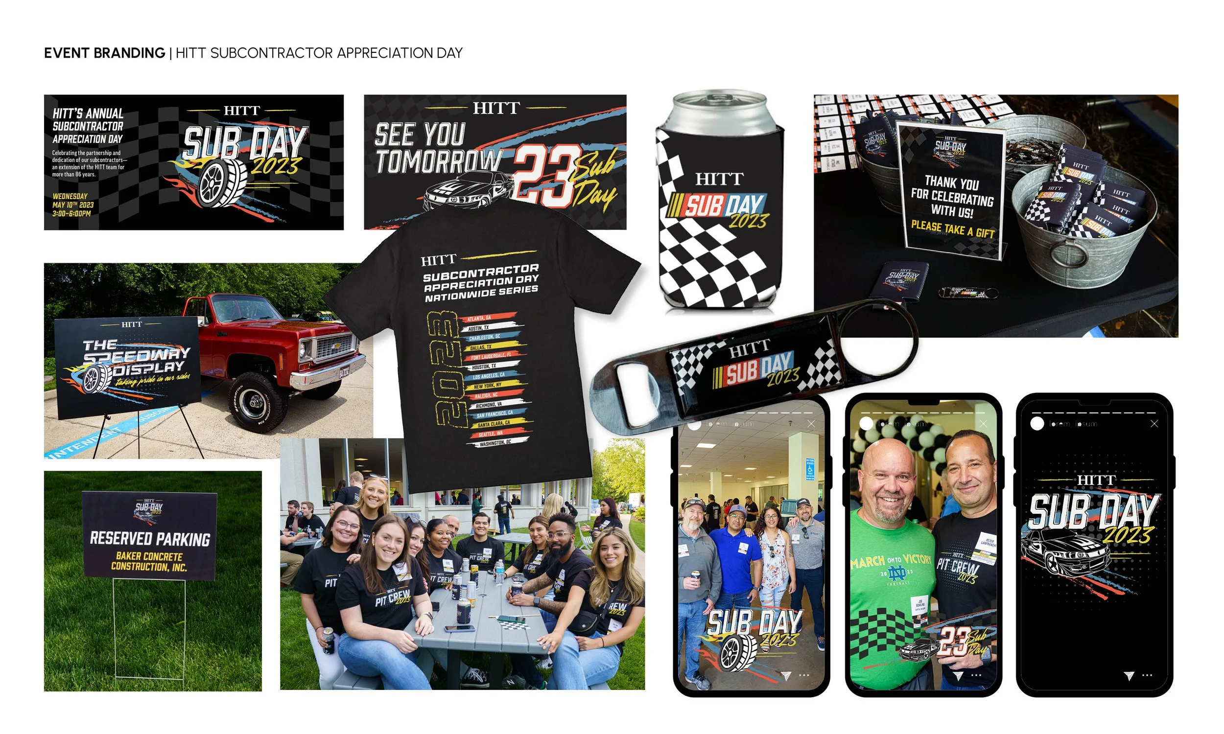
I spearheaded the event branding for HITT’s Subcontractor Appreciation Day, a lively celebration marking another successful year and showing deep gratitude to subcontractors. The event carries a fun and festive atmosphere, often themed around sports.
After conceptualizing several ideas, my NASCAR-inspired designs were chosen as the central theme. The comprehensive suite of event materials I developed included nametags, wayfinding signage, both internal and external event signage, digital graphics, social media assets, and promotional items such as koozies, shirts, and bottle openers. Additionally, I designed event materials like tablecloths and popcorn holders to further enhance the theme and create a memorable experience for attendees. Each piece was crafted with attention to detail and a focus on reflecting the event's spirited nature.
I produced designs for the complete branded suite of event materials for AUTM’s annual conference, in collaboration with an Art Director. Our design process began with conceptualizing around the conference’s pre-determined mascot, Naive the whale. After refining iterations, the whimsical and tech-inspired final design of Naive became our key artwork, influencing the entire visual identity. The design features playful elements like small molecules dancing around Naive, reflecting AUTM's role in technology transfer software.
The project encompassed a wide range of branded materials including name tags, wayfinding signage, indoor and outdoor displays, floating pool lights, lanyards, apparel (shirts and towels), social media graphics, a comprehensive meeting program, and digital advertisements. Each piece was crafted to enhance the conference's theme and create a cohesive, engaging experience for attendees.
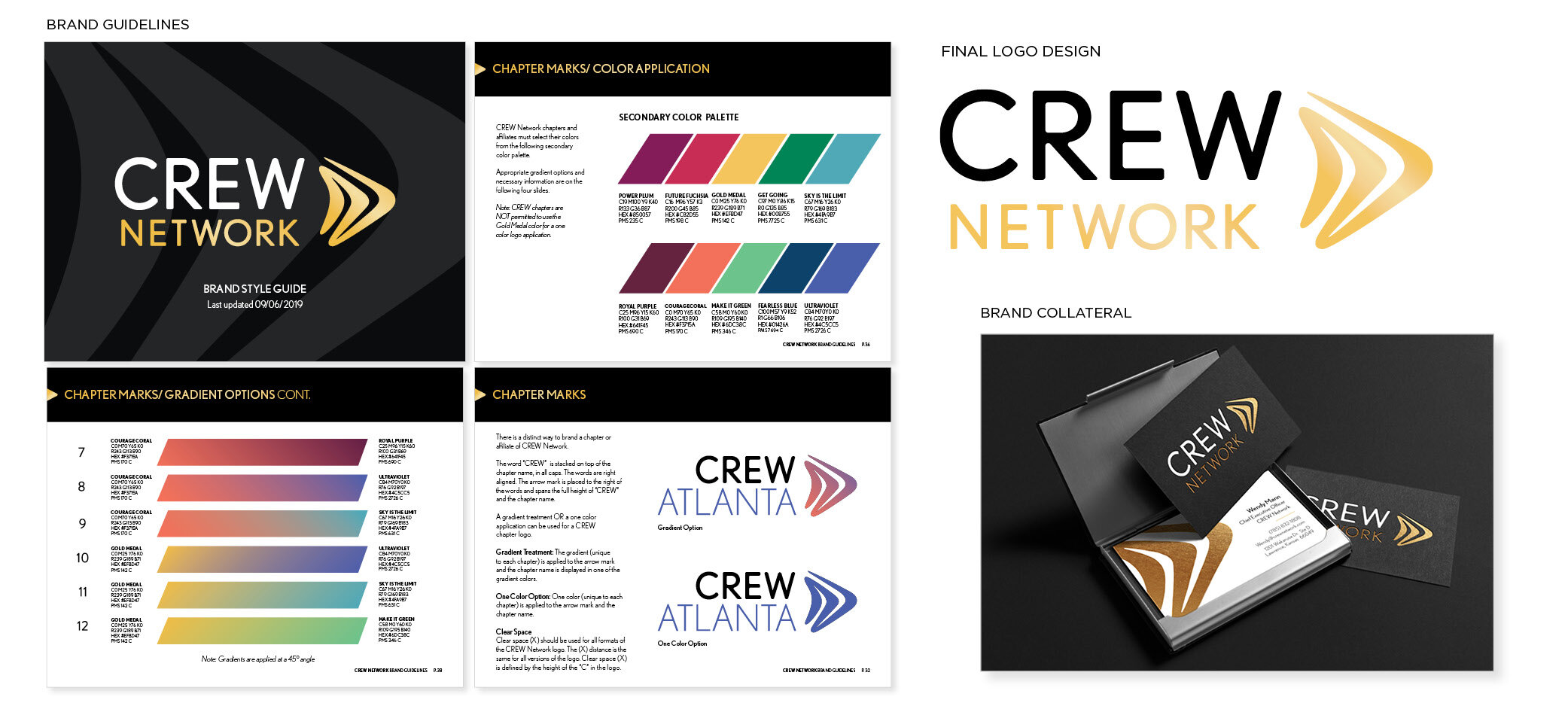
This design was done in collaboration with the creative team at Beyond Definition. After several rounds of discovery and pitching my design ideas, my sketch was selected for the new logo. As the designer on this project while working at Beyond Definition, I was tasked with the creation and design of the new brand guidelines which included the challenge of allowing each of its 77 global chapters to form their own unique identities. The robust secondary color palette (which includes custom color names unique to CREW) and subsequent gradients provided created excitement throughout the Network, essential because the chapters could exercise control over their own identities. More about this project can be found on Beyond Definition’s website here.
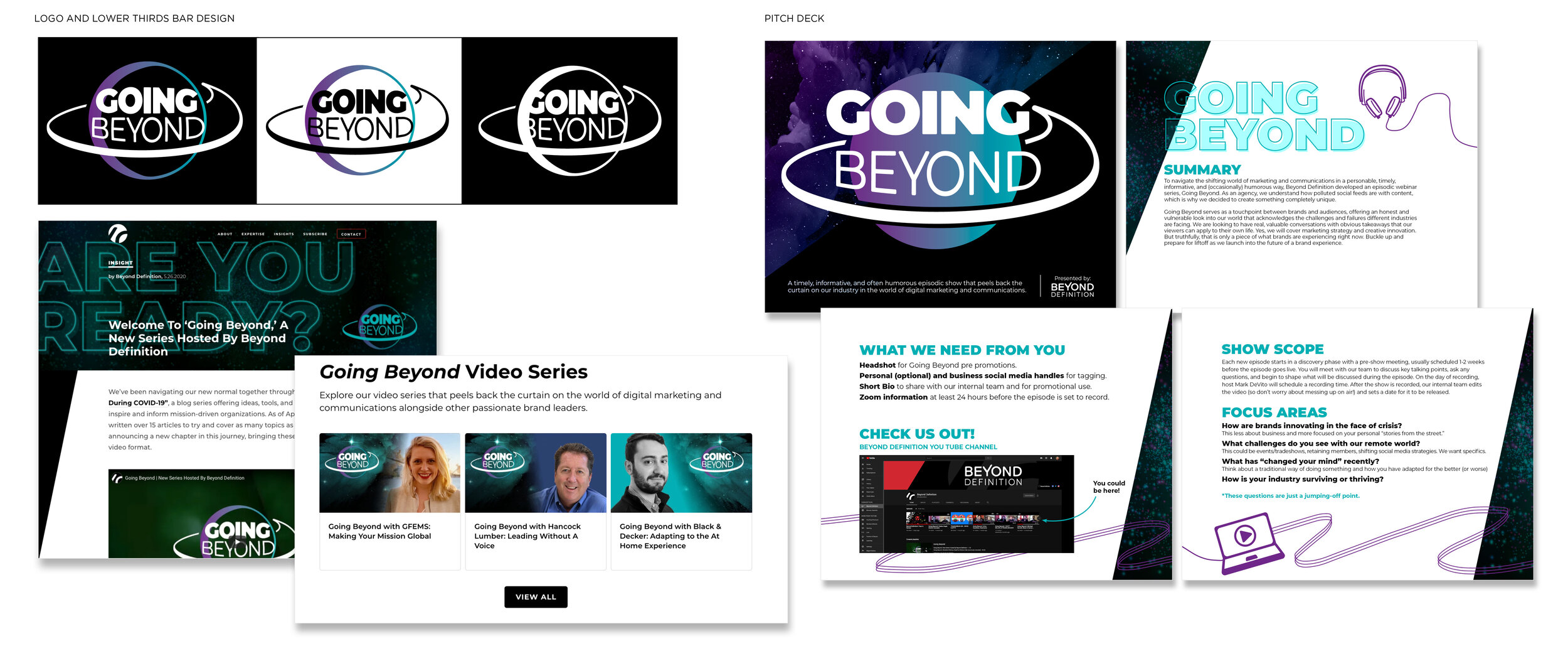
Visual identity and content promotion for monthly episodic series ‘Going Beyond’ which features engaging conversations with passionate brand leaders in the marketing and communications industries. The logo design is a fusion of planetary shape and the symbol for a speech bubble and is meant to be playful, unique and quirky—as are many of the conversations on the series.
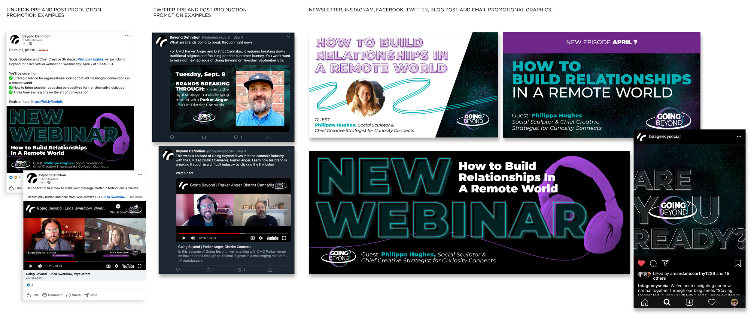
Pre and post-production promotional assets for ‘Going Beyond,’ intended to promote viewership, spread awareness, participant engagement, and create a cohesive brand identity for the series.
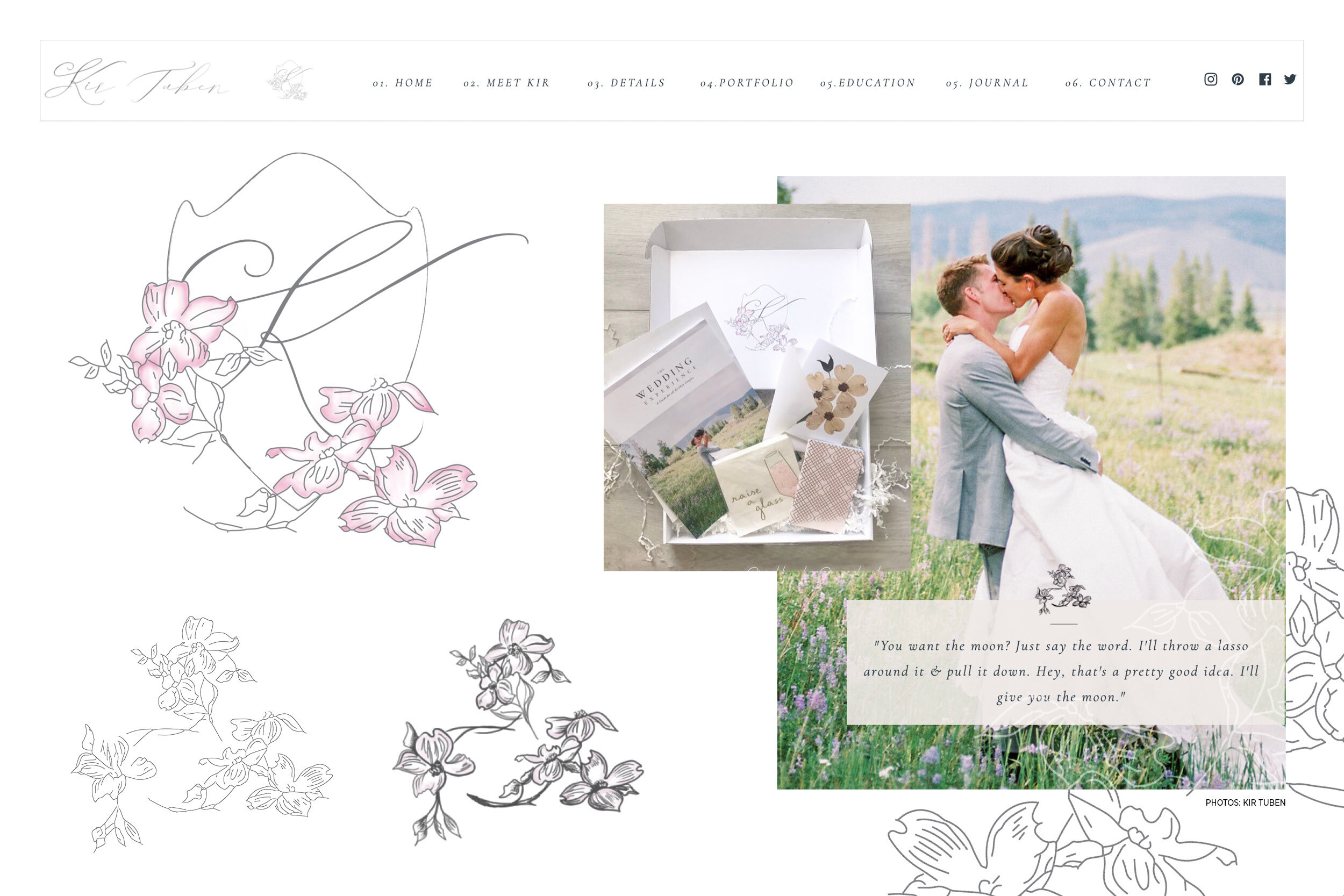
New logo, custom typography and branding elements for Kir Tuben, a well-known wedding photographer in the DC region. Kir approached me wanting a totally new look. She provided strong inspiration pieces such as the dogwood flower and the shield shape. After looking at competitors in the area, I created these designs in order to make her aesthetic look like it was a part of the wedding photography industry but stand apart from the others. The custom typographic script is flirty and feminine, peeking bashfully from behind the dogwoods.
As creative lead on the City Energy Project rebrand I oversaw the redesign of the existing website and facilitated the production of over 40 accompanying pdf resources. These resources range from 1 page to 20 page and vary in complexity of content. The project as a whole provided many design challenges due to the highly academic quality of work, the existing logo, a non-linear narrative and the difficult taxonomy of content. It was also a new target audience for me, mid-late career adults in the building and energy efficiency industries. My main goal was to make the brand more modern, appealing and approachable, while keeping it free of distraction and focusing on the work of researchers contributing. After attempting several uses of shapes and designs for the homepage action graphic, we finally decided on the circular navigation tool (shown above and below) and concentric circle designs in order to compliment the existing logo rather than fight it. The website went live in January 2019.
Above are some examples of the PDF resources that accompany the City Energy Project rebranding (not ultimately intended for print). The concentric circles not only reinforce the brand but serve as navigational tools throughout the documents, beginning on the table of contents and carried throughout in call out boxes, infographics, footer design and calls to action. The 4 main categories are given color identities on the home page of the website and are consistent as the user navigates through the site. The resources are also color coded according to what category they belong in.
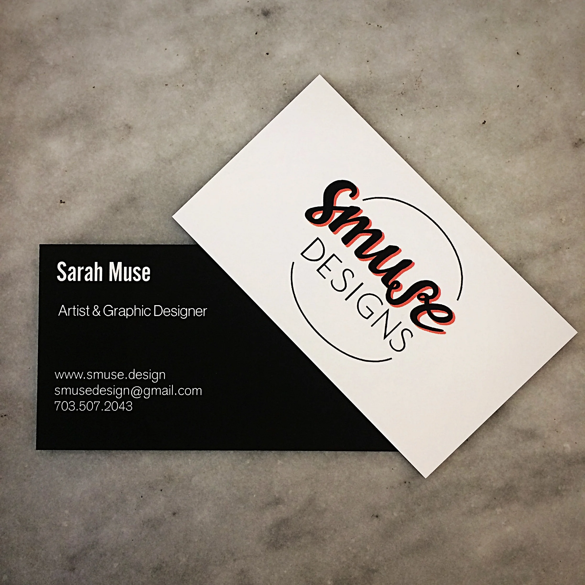
Business Cards for Smuse Designs! Design inspiration from years of doodling 'Smuse' on notebooks, binders, napkins, etc. I wanted something fun and quirky but clean and professional with just a hint of color.
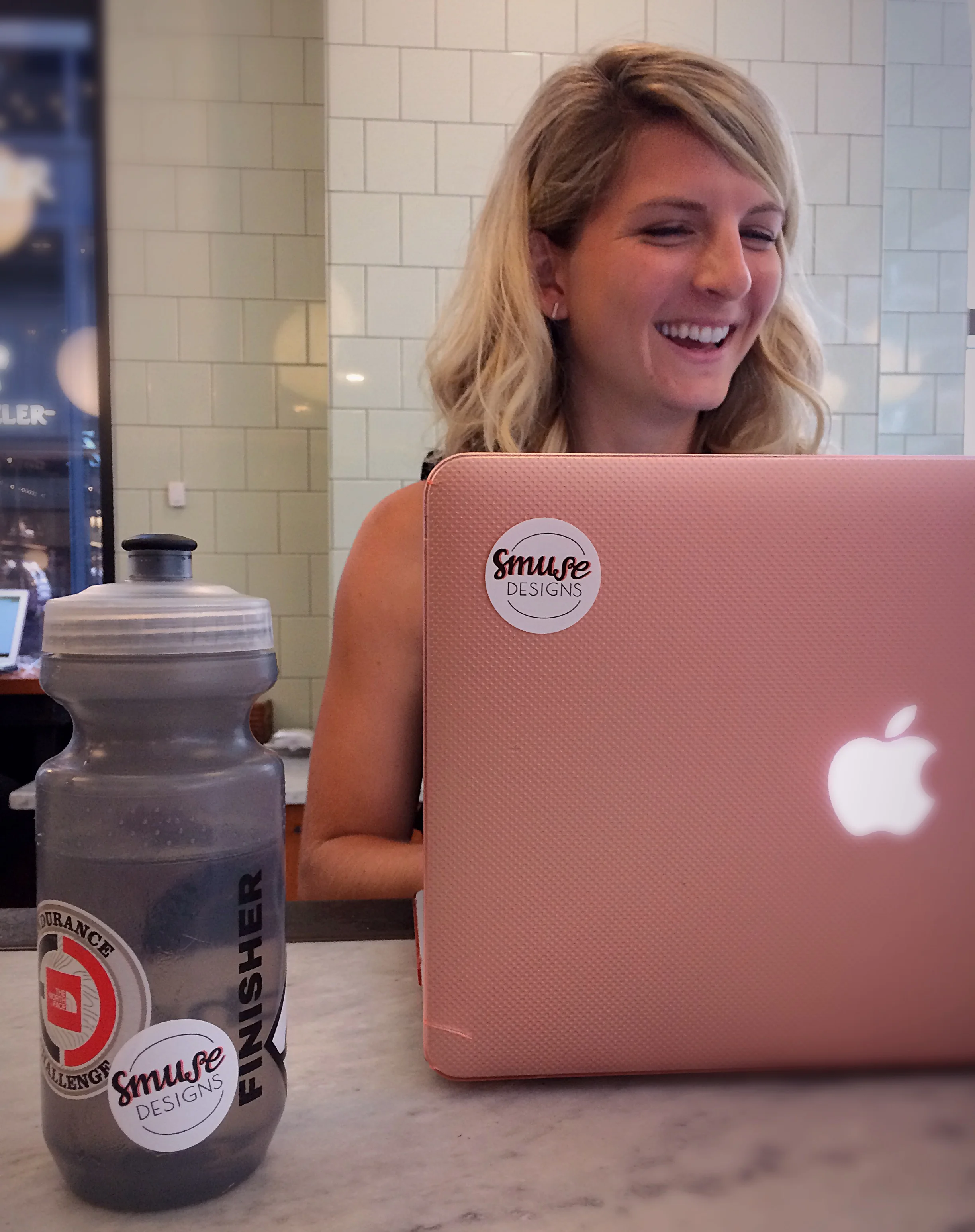
Cute stickers for marketing Smuse Designs! Want some? Email me!