


Watercolor, Acrylic or Oil Paintings. Pen & Ink Drawings.
On-site painting or made to order.
I orchestrated the creative vision and design implementation for the 2023 HITT Year in Review website. Collaborating closely with the communications team and top company executives, we identified five pivotal pillars from the previous year’s data that encapsulated the year's achievements and charted the course for HITT's future endeavors. Utilizing animated typography, we highlighted these core themes in a dynamic way, illustrating their continuous evolution and impact on HITT's trajectory.
In addition to the website, I created a suite of animated social media and email graphics, diverging from our typical design approach to capture attention and signal a change in direction. This comprehensive digital platform serves as a showcase for our strengths and successes, reaching employees, partners, and clients alike, and reaffirming our commitment to excellence throughout the year.
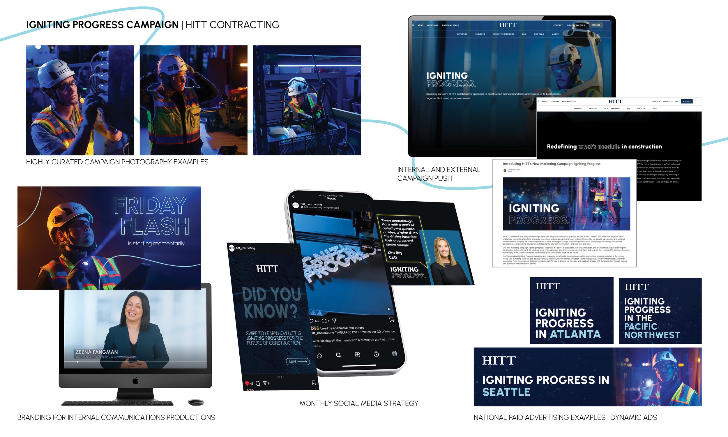
Igniting Progress Campaign for HITT Contracting
Role: Campaign Creative Lead | Brand Strategy | Art Direction | Cross-Channel Integration
Timeline: 2025–2027 (leading up to HITT’s new HQ launch)
Overview: Igniting Progress is a newly launched, nationwide brand campaign designed to position HITT as a visionary leader in construction innovation. Rooted in the idea that curiosity drives transformation, the campaign showcases how bold ideas—when backed by trust—can lead to breakthrough advancements. Spanning two years, Igniting Progress will highlight HITT’s investments in technology, research, and forward-thinking practices, culminating in the opening of the company’s new headquarters.
Strategy: This integrated campaign spans digital, print, social, experiential, and environmental touchpoints. From AI-inspired visual storytelling to real-world innovation case studies, every element is crafted to reinforce HITT’s culture of curiosity. Messaging is unified across departments, elevating both internal engagement and external brand perception.
Execution Includes:
Unified messaging across marketing, development, and operational channels
Custom campaign lockups and visual language system to maintain brand consistency
Storytelling framework highlighting "moments of curiosity" that led to breakthrough outcomes
Multi-platform rollout including microsite, social campaigns, video storytelling, jobsite activations, and thought leadership pieces
Integration with recruitment, internal comms, and philanthropic storytelling initiatives
Looking Ahead: As Igniting Progress unfolds, it will build anticipation and brand equity ahead of HITT’s new headquarters reveal—serving as both a celebration of the company’s future and a signal of its continued leadership in shaping the future of construction.
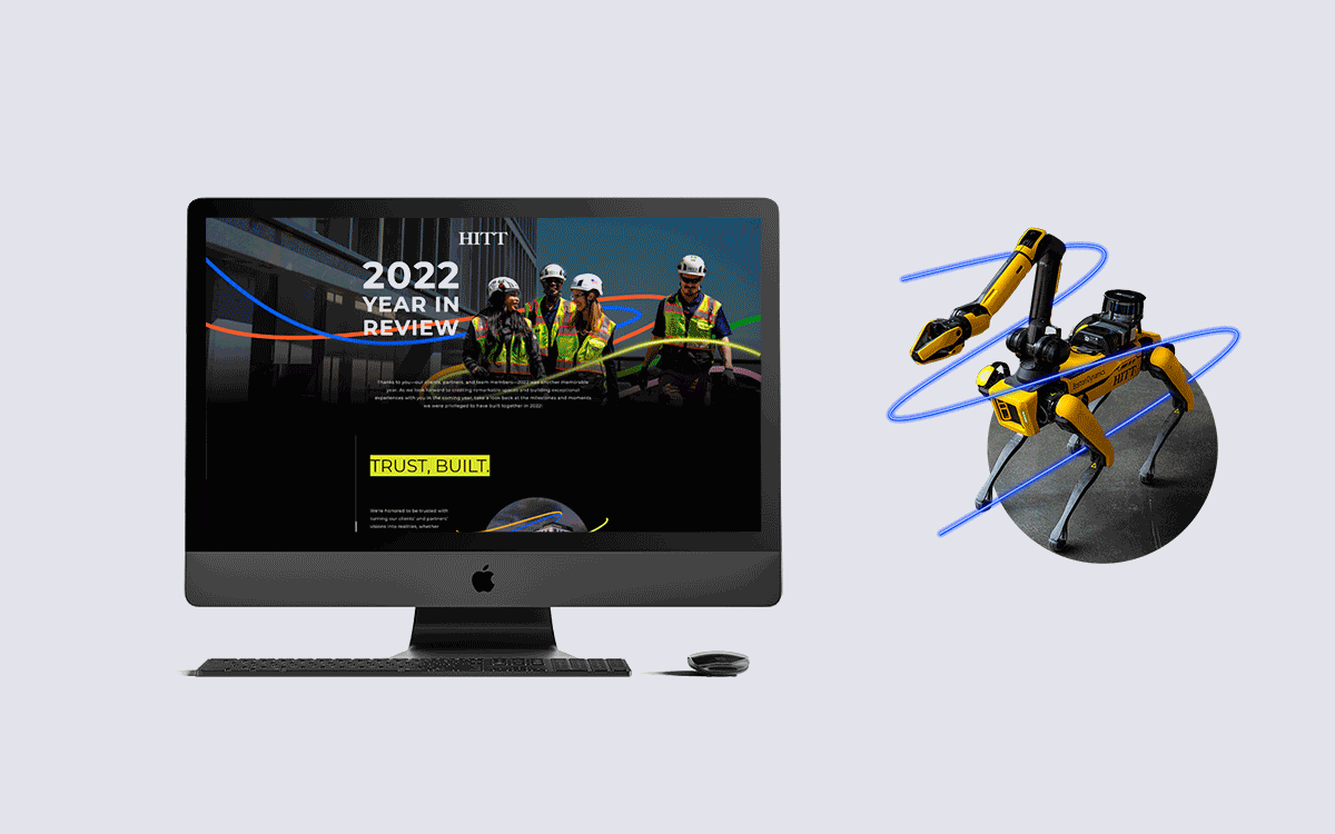
As the Creative Director for HITT Contracting's 2022 Year In Review website, I spearheaded a collaborative effort with our communications team to curate a visually engaging and thematically cohesive website that showcased our successes from the previous year.
By meticulously gathering data spanning the entire year, we identified key themes that stood out. Each theme was paired with a corresponding color, and strategically woven throughout the site to visually represent the interconnectedness of our work and achievements.
The colors come together at the start and end of the site to show that every piece of what we do contributes to the overarching mission of HITT. This annual review website serves as a cornerstone for internal reflection and external outreach. With its widespread distribution among employees, clients, and partners, this project exemplifies our dedication to fostering strong relationships and fostering a culture of innovation and collaboration.
A sample of the visual style created for a campaign titled “Trust, built.” for HITT. The main objectives of the campaign were to launch a brand refresh and increase brand awareness, as well as to remind clients of the trust HITT has established with them over the years. The campaign imagery is meant to evoke inspiration and feelings of security and familiarity. The use of multiple layers, micro animations, and industrial textures to create collage-style compositions is reflective of the concept of “building” layers of trust among clients and colleagues.
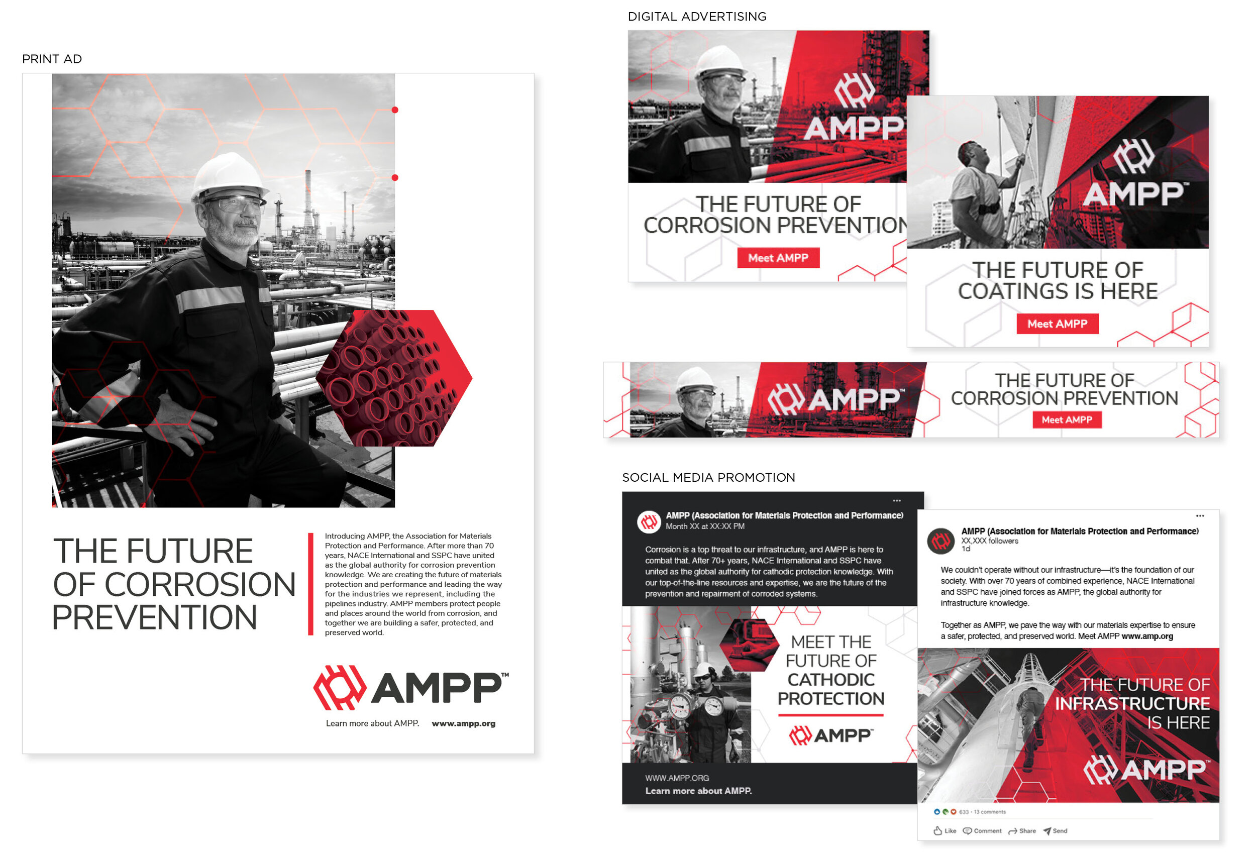
Digital and printed materials for AMPP brand launch campaign. Two leaders in the corrosion prevention and coatings industry, NACE International and SSPC: The Society for Protective Coatings, joined forces to advance the future of materials protection and performance. The new name, AMPP (Association for Materials Protection and Performance) needed a brand launch campaign that asserted their new identity and conveyed a sense of protection, strength, innovation, and energy on a global scale.
These designs were produced to solidify the new brand name and identity, and to excite existing members about the transition and what the future holds for the coatings and materials protection industries.
More information about this renaming and launch campaign can be found here.
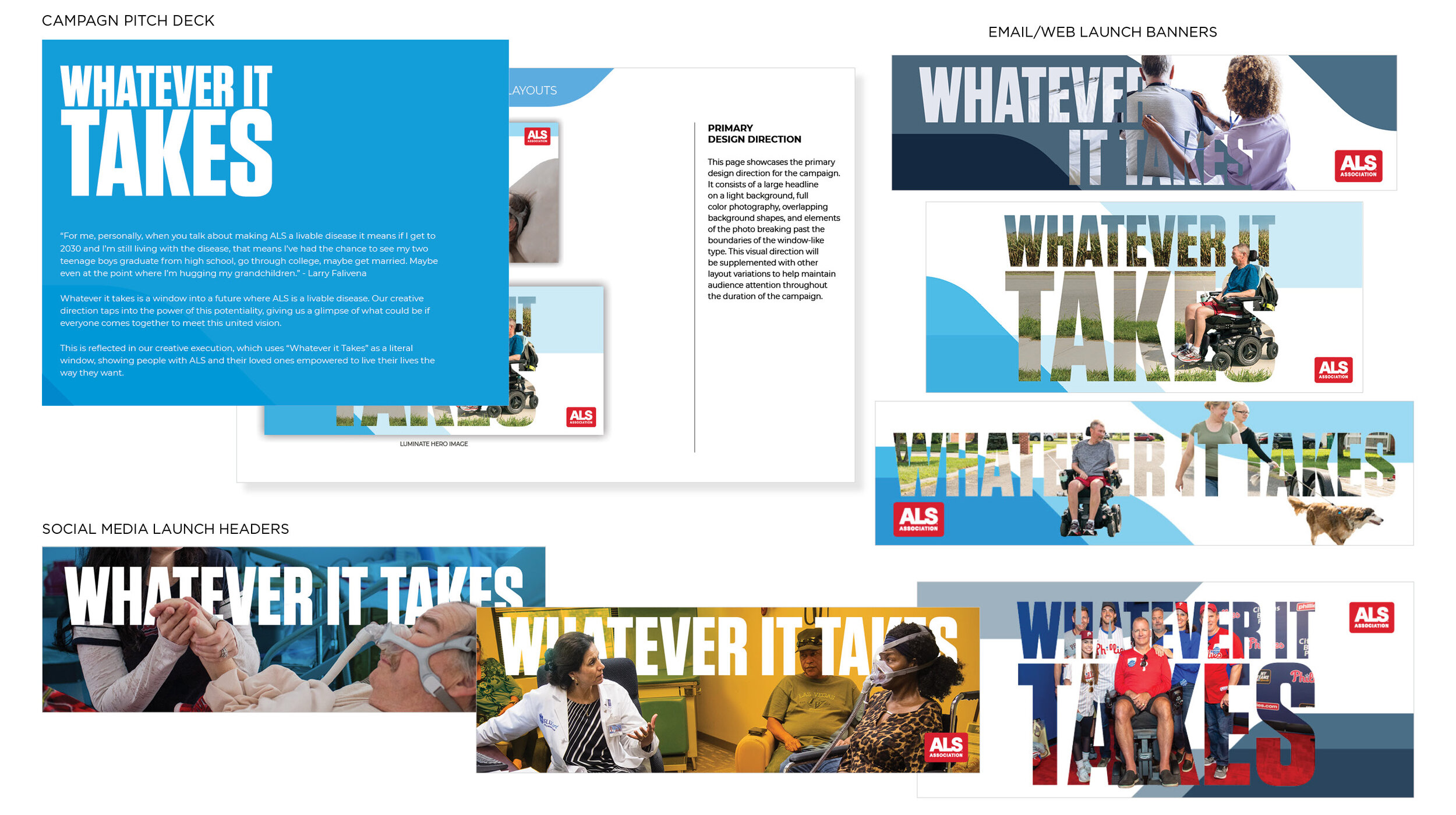
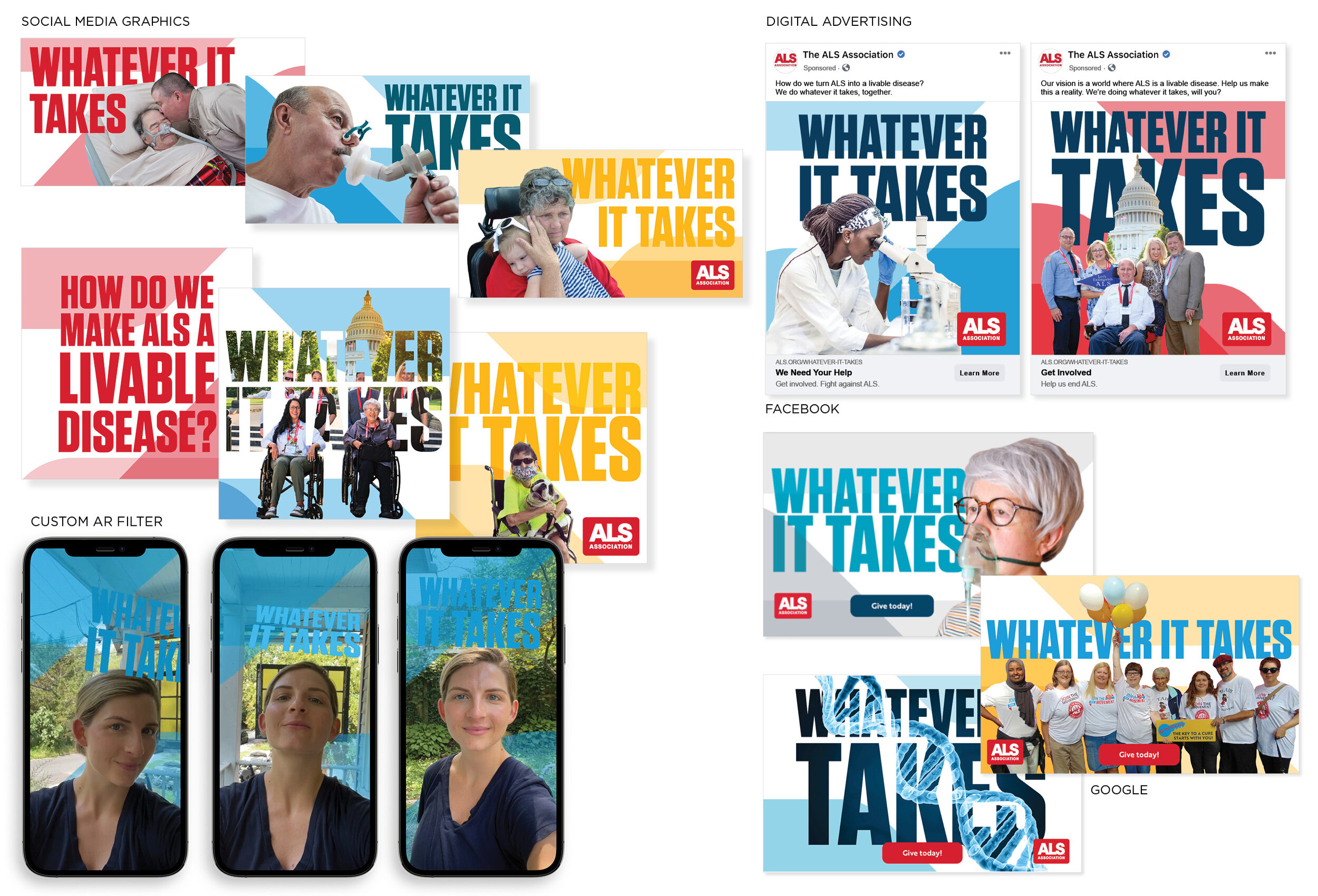
Whatever It Takes campaign for the ALS Association launched in summer 2021. The Whatever It Takes campaign represents a window into a future where ALS is a livable disease. The goals of this campaign were to highlight three major areas for the ALS Association including Research, Advocacy and Patient Stories. This was a digital campaign utilizing multiple social media platforms, paid digital ads, email and web design. This campaign was months long and needed to be flexible, we utilized the full scope of brand colors along with an extensive image library to keep things fresh and interesting, and engage with the ALS community. This is a sample of campaign collateral, as hundreds of social graphics were created throughout the campaign. I served as a designer for this campaign and worked closely with the creative and strategy teams at Beyond Definition to execute this campaign.
Social graphics, paid ads and a custom AR filter designed using Spark AR Studio. The purpose of the social media filter was to collect user-generated content and reach a younger generation of people who’s lives are affected by ALS.
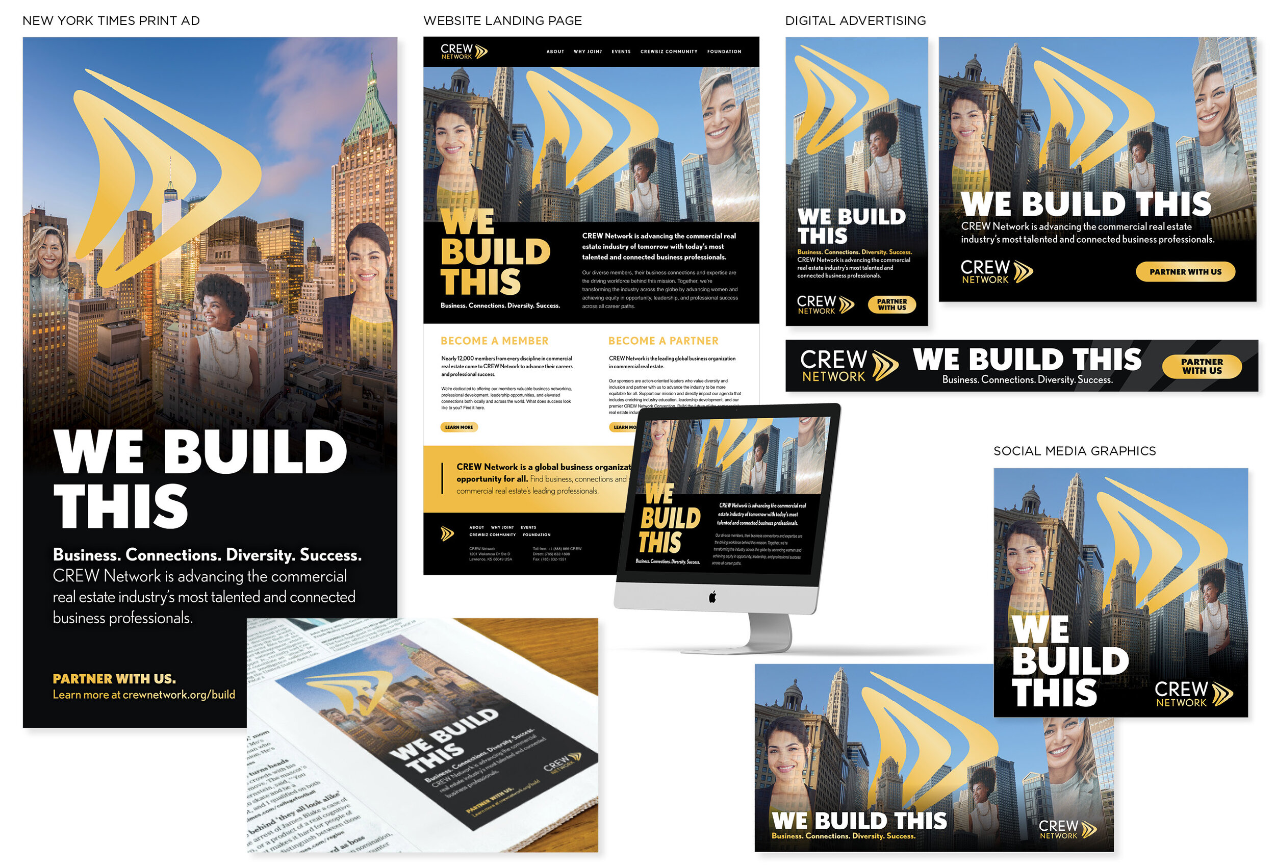
Samples of the launch materials for the new logo and visual identity for CREW Network. This campaign centered around the idea that CREW is a strong, diverse and capable network of women impacting the commercial real estate industry worldwide. The purpose of this campaign was for women working in commercial real estate to see themselves reflected in the women featured in the campaign (real CREW members) and recognize their potential to further their careers by joining CREW.
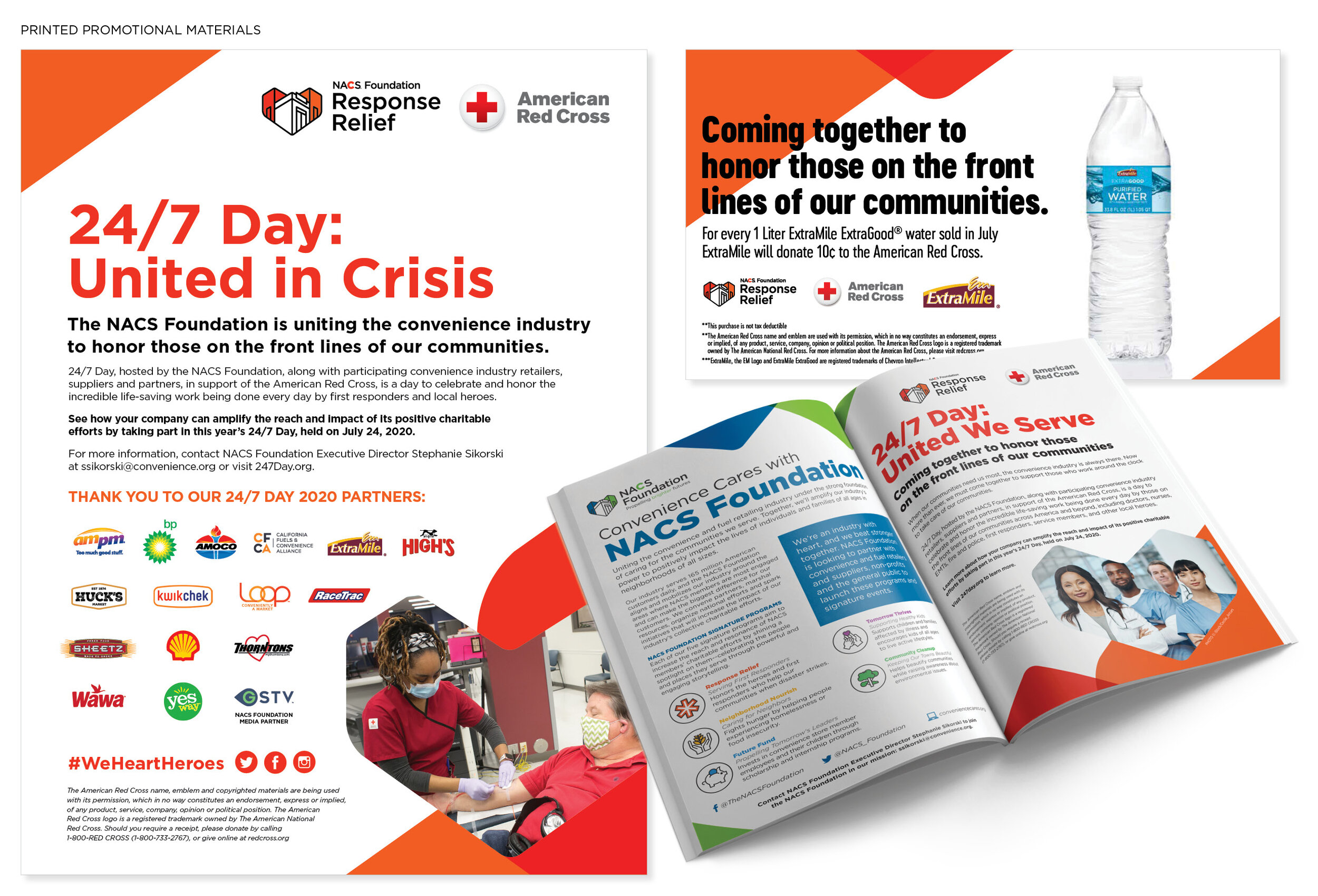
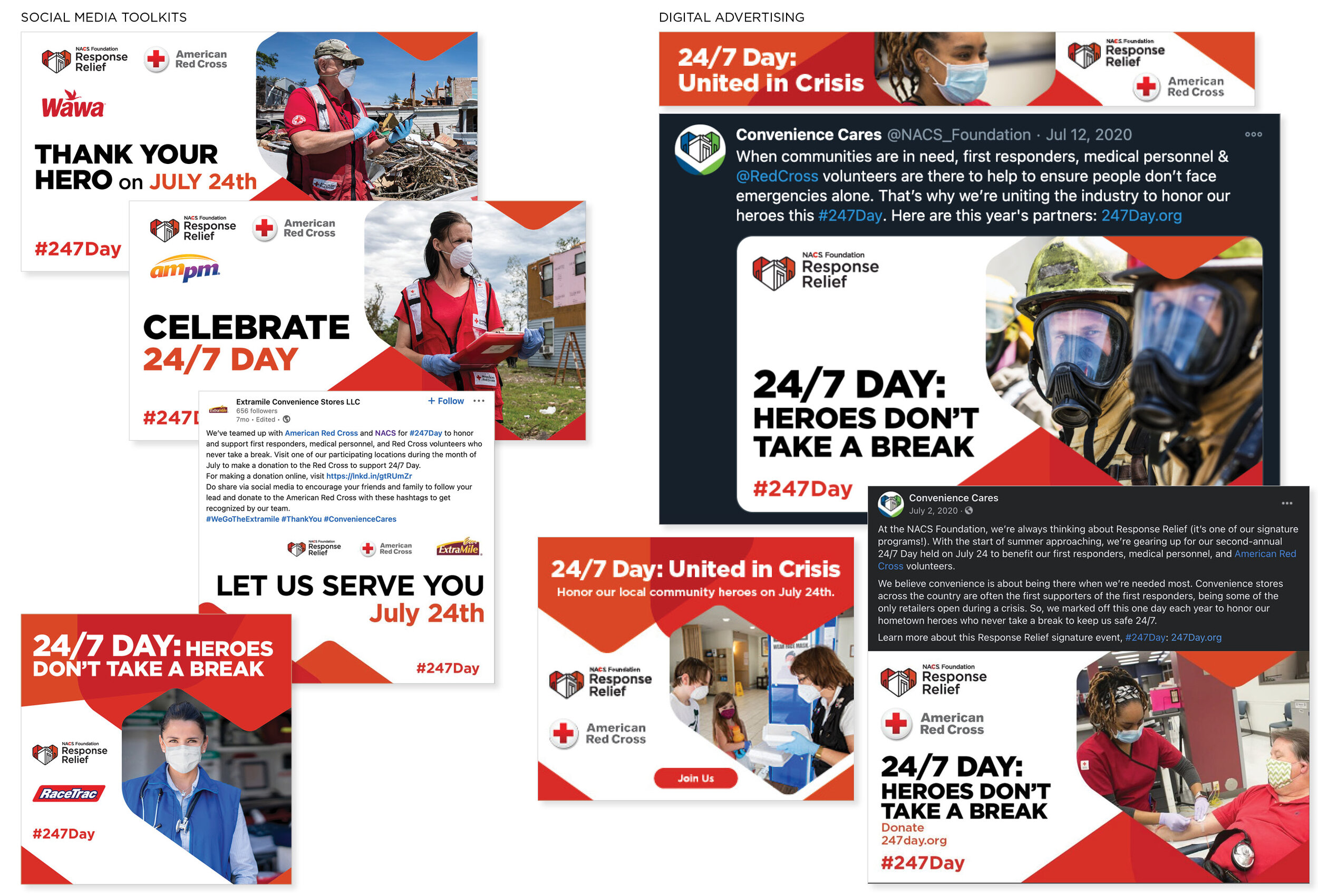
Examples of design collateral I worked on as a part of the integrated marketing campaign promoted the NACS Foundation Response Relief program’s signature event, 24/7 Day. This campaign focused on the life-saving efforts being made by first responders and local community heroes combating the COVID-19 pandemic by honoring them through customized retail partner offerings, in-store POP, radio, TV spots in partnership with GSTV, and social media storytelling; and raising funds for the American Red Cross.
During the planning stages of the 24/7 Day campaign, the event was challenged by several major external influences including the global COVID-19 pandemic, lockdowns and shelter-in-place mandates. Many convenience stores remained open during these trying times to serve the communities in need and first responders were on the front lines keeping communities safe. The team working on this campaign at Beyond Definition quickly adapted the campaign messaging and strategy to ensure that 24/7 Day was a success.
This campaign had 18 convenience and fuel retailing partners joining from across the country to offer free in-store offers for first responders on July 24th, a 500% increase in the number of partners from 2019, as well as three new additional partnerships, a media partner, GSTV, and two promotion partners. Overall, the campaign had more than 295,000 organic impressions, 1.2 million paid impressions, plus 20.4 million impressions through GSTV, with 15,630 tracked engagements.
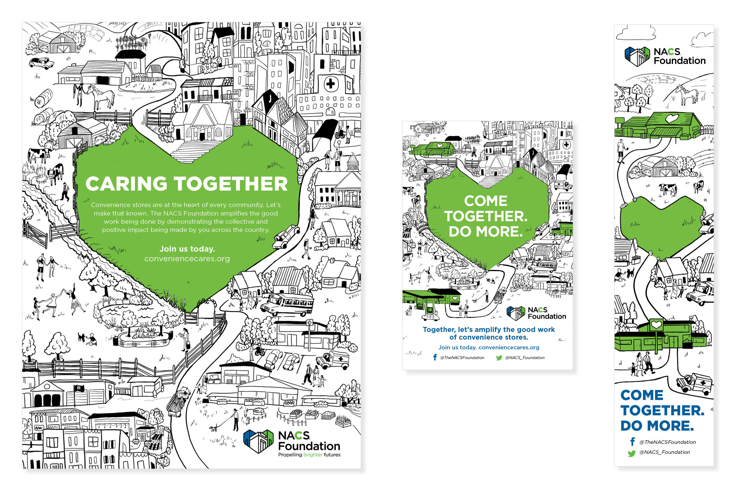
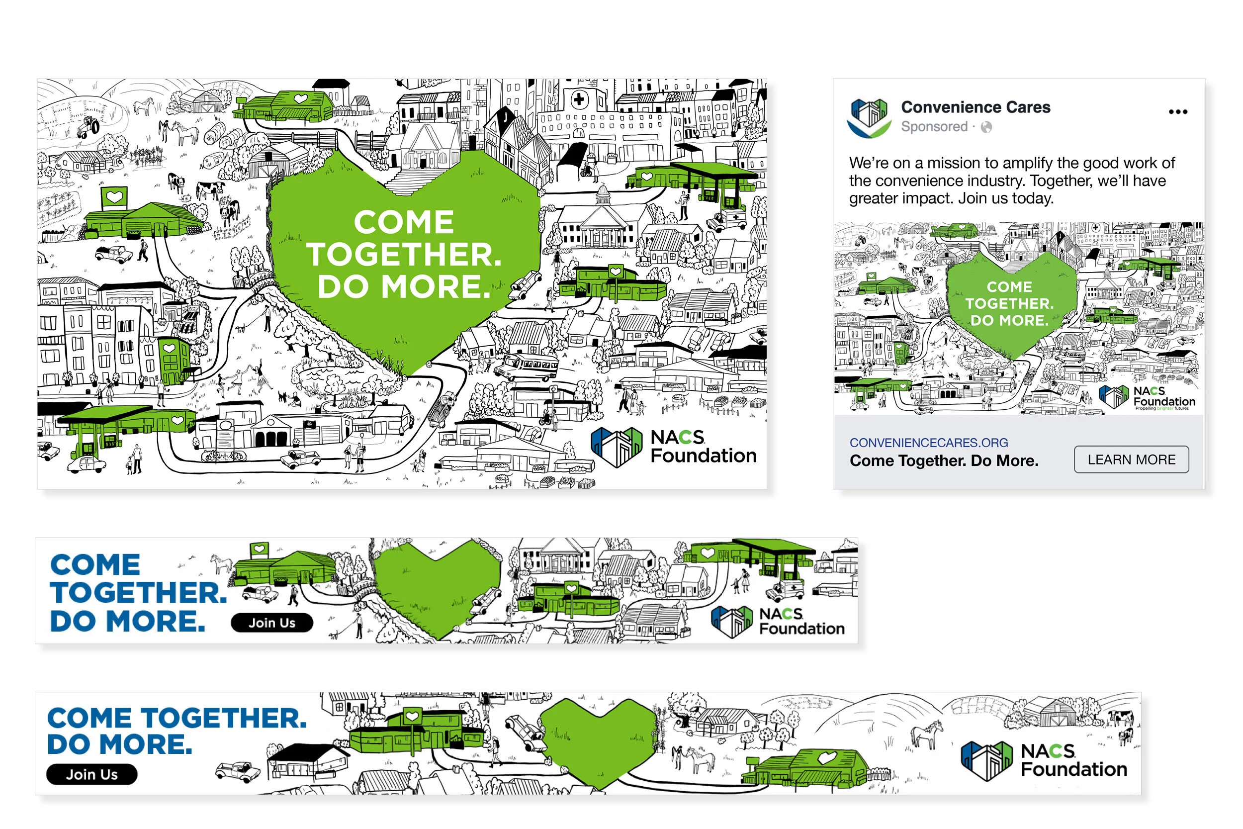
Print materials for a national campaign promoting/launching the NACS Foundation (National Association of Convenience Stores). As a designer on this project while working at Beyond Definition, I was involved from the early brainstorming phase of campaign concepting. The messaging concept of the campaign was that convenience stores are the heart of the community, and that with more sponsors and members, more good work can be done than it can as stand alone stores. The campaign goal was to spread awareness of the foundation, and attract convenience store members to their efforts. My illustration concept with the NACS heart being a focal point was selected and I moved forward as the go-to designer to replicate the campaign concept through various collateral pieces. I created custom illustrations to show different types of communities throughout the country, with clear pathways from the green heart in the center (the outline of the NACS logo) to the convenience stores that service those communities.